Semester

Pumpkin bowl for Artists Tell Stories

Dazzle Camouflage P

Patch Vase

Lemon Plate

Dandelion


My favorite of these so far is the Patch Vase. I don’t really enjoy handbuilding but this wasn’t too bad. It came out pretty good in terms of the form. I tried to do something new with how I am glazing it. I tried inconsistent brush marks and will be using a slip transfer technique. I also plan to leave it matte but that may change in the future.

(Untitled)

Teapot, Kathryn Finnerty

(https://santafeclay.com/products/teapot-kathryn-finnerty)

This teapot is made of terracotta clay. It was thrown on the wheel and embellished with a glossy glaze.

Texture and color are an important part of this piece. I’m not sure whether this was intentional or not, but when on a white background, the spout and top look like they’re cut out and forming negative space.

Rhythm, texture, and emphasis are key to this vessel. Emphasis is placed on the white parts on the vessel- the plainness of it contrasting the detailed parts. Rhythm is in the detail with the texture, the bumps forming an image and embellishing the form.

This is a utilitarian form. I feel like it doesn’t have a hidden meaning, but is just aesthetically pleasing

Image result for kathryn finnerty ceramicsImage result for kathryn finnerty ceramicsImage result for kathryn finnerty ceramics

I chose to group these together with the first picture because they all have a design-like rhythm.

5

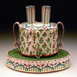
In a presentation, portfolio, or collection, many things are taken into consideration. For starters, design- if it’s functional, practical, etc. Patterns with lines, shapes, etc. are also searched for. Style is important as well, but there still needs to be variety.

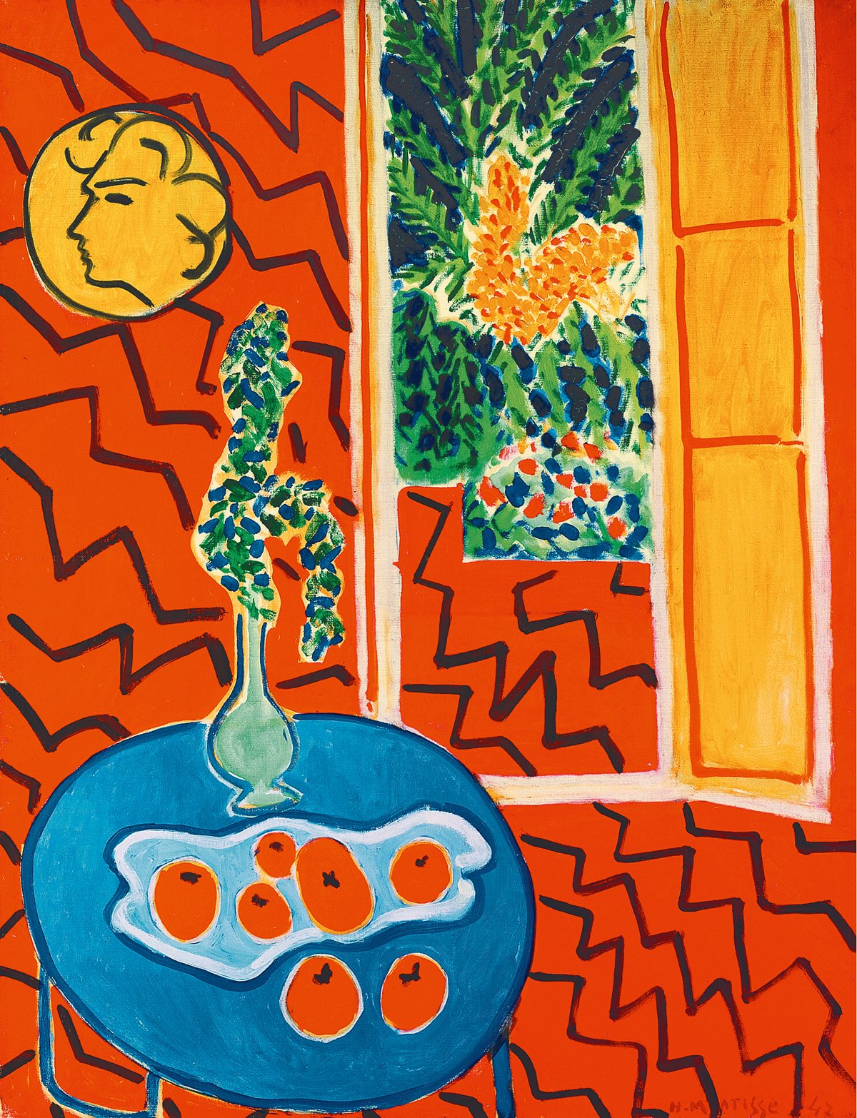
Presenting and sharing artworks shapes ideas, beliefs and experiences, because art is influential. Every artist can tell you they’ve been influenced by a piece or an artist, whether it be to try something new or work on something specific. Maybe they liked how an artist chose to do something, and would incorporate that technique in their work. Maybe they liked what the subject the artist chose and decided to try it out for themselves.

Criticizing art is a way of learning from it. Seeing errors, mistakes, etc. can help you learn from those faults and how to avoid them. It can also show you what was done correctly, and maybe you could learn in a positive way from how it was done.

(Untitled)

Glazing my bowl proved to be trickier than I had expected. Though it didn’t initially seem like a big deal or make much of an impact on anything during the glazing process, after it was glaze fired, any sort of colors overlapping one another made it look a bit sloppy and messy. The glazing came out blotchy and inconsistent, which might be my fault because I probably didn’t do as much layers as I needed to. I also didn’t spend enough time focusing on making a proper ombré, so rather than having a subtle fade, it came out much harsher than I intended it to.

As for the pumpkin, there wasn’t much room for error. I kind of wish that I made the stem more darker to create more contrast. I could have also spent more time mixing colors and painting it between the “lines” of the pumpkin to create a bit more depth. Rather than creating a small version of a normal sized pumpkin, I wish I created a full-scale replica of a small pumpkin. It is cute though so I am pleased.

Comparative Studies

Image result for henri matisseImage result for betty woodman expressionist vase

Henri Matisse                                                    Betty Woodman

In my comparative study, I compared the two artists Henri Matisse and Betty Woodman. I chose to compare these two pieces because I personally like the style. They’re both abstract and focus on line, space, shape, and rhythm. Both of these artists use these elements and principles and they work together. They both focus on the same thing- producing visually pleasing art in an abstract way. They both know what to do to get their pieces to work. The lines create an interesting rhythmic effect and fill space that would otherwise be boring. They also create contrast in both of their pieces using color. Matisse uses orange and blue- complimentary colors. Woodman uses a variety of colors that can make certain things stick out.The shapes they use also create a unique visual effect. Woodman uses simplistic shapes to create objects and a setting, while Woodman uses unusual shapes to create a nice look with negative space.

2

Making the letter P brought me back to handbuilding for the first time in awhile. (Reminding me how im too impatient for it) The building process for this letter took awhile, but not nearly as much as my letter A from the previous year. Teamwork is an important asset to making a project on this scale, and if it were not for the people I worked with, this project may not have gotten done in the amount of time it did with the quality it is. Everyone worked together on different things and gave each other help and advice when needed.

Trying bedazzling was fun and interesting. It was a bit weird to paint, but it worked. When i went into the library to take a picture of the final result, I immediately spotted the ‘i’ before even noticing the rest of it. I was worried at first that the design would be too simplistic to create a “camouflage” effect, but it worked- it even got mw for a second, and I’m one of the people that made it.

3

While waiting for my thrown bowl to be fired, I wanted to try something new. Applying slip for texture on my pots isn’t anything new to me, but applying it to a hand built item is. Recently, I have been making pumpkins the focus of my art; in both my pottery and paintings. I made pumpkins by making an enclosed pinch form, and rubbing my tumbs over it to create the ridges. To make the lines on the pumpkins, I used a paintbrush and slip. No pumpkin is perfect, so I created a few dots with slip as well. I want to make this a recurring technique in my work.

I received feedback on my bowl and I agree with most of it- I do have a lot of empty space within my project that needs to be filled. So I’ll likely be adding birds and maybe even lights to fill it and make the project over all a bit more interesting. I’ve always struggled with filling space, and while I’m working on that in my 2d art I might as well work on it in my pottery, too.


1

This would turn out to be the second time I’ve done a letter, this time a P instead of an A. All of the artists did well collaborating together, taking turns making coils, smoothing the piece, and overall constructing it. Since it was my second time tackling a task like this, I was able to offer helpful advice. I remembered that when making the A, the walls were not connected enough. As a result, the piece cracked and didn’t look as nice as I had wanted it to. I tried my best to make sure that the edges where the walls connected were as smooth as possible.

In class we learned about dazzle camouflage, which was painted on ships. Dazzle camouflage made it difficult for other sailors to spot which direction the ship was going, as well as making it hard to tell the front from the back. We were assigned to create three dazzle designs to put onto our letter. It was a bit difficult, as I didn’t really understand dazzling too well. However, I finally came up with a design that I was satisfied with, and that I will present to my group when we share our ideas.

13

Green cylinder

Red earthenware, glaze

5″ x 4″

Generic pot

Red earthenware, glaze

4″ x 3″

Tree

Red earthenware, glaze

7″ x 5″


Flowers

Red earthenware, underglaze, glaze

5″ x 7″


Starry Night

Red earthenware, underglaze, glaze

6″ x 4.5″

My artwork represents my growth as an artist. Between my posts from last year the ones from the beginning of this year, you can see how my artwork has improved. A good example of my art making skills developing is the green cylinder I made and the Starry Night pitcher I made. The green cylinder is bland, has poor glazing and thick walls, and has no sort of texture or unique design. In contrast, my Starry Night pitcher has texture done with slip, and is glazed evenly with a design inspired from Vincent Van Gogh. The Starry Night pitcher is a lot less boring compared to the green cylinder.

If I could redo any of my artworks, it would probably be the red tree bowl I did. The bowl was a bit bumpy, and the idea behind the design is cute, but poorly executed. I feel like I could have done better, and now I would probably do it with texture and multiple shades of red. I would also try to make the background more interesting, rather than just having it be blank and the same color as the tree.